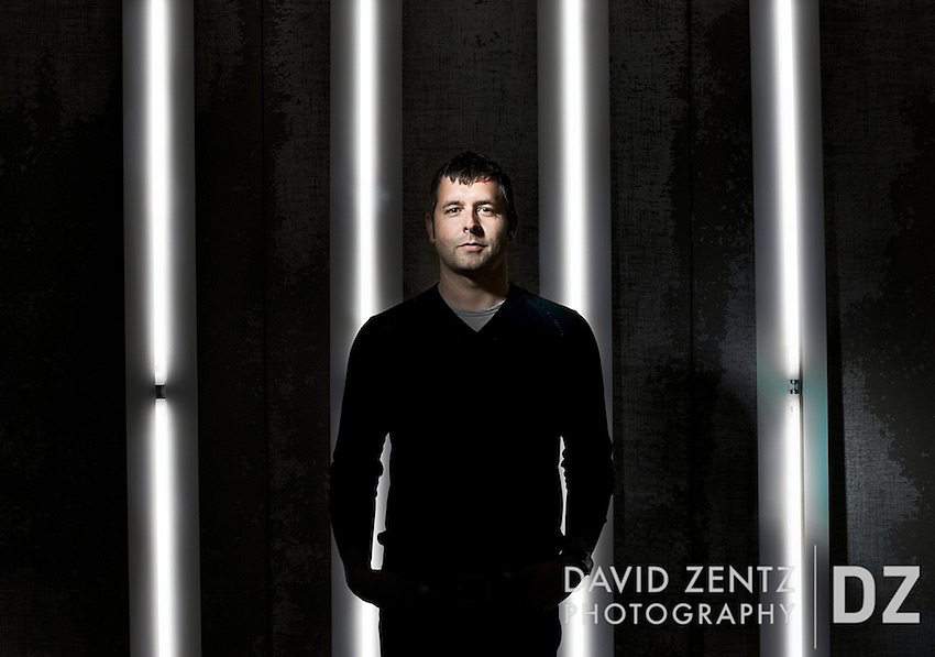
It’s great when you find a subject who’s willing to work with you to create a better photo. For example, here’s a recent shot of architectural lighting designer Sean O’Connor that is running in this month’s issue of Architectural Lighting magazine. I had a fun time working with Sean, who runs his own firm in Beverly Hills.
For the assignment, I was pretty much given free reign to shoot photo that somehow conveyed the fact that the subject worked with light. Not knowing what my options were, I called Sean up to find out. At first neither of us had any clear ideas. Sean was reluctant to shooting in his office, but didn’t know of any alternatives that were available at the moment. It wasn’t because there’s anything wrong with it – it’s actually a stylish, loft-style office with plenty of natural light and a view overlooking Wilshire Blvd. – but more due to the fact that it’s been used before and he was interested in doing something different and more creative. So was I. But because he currently had no local projects in or around which to shoot we decided to shoot there anyway, but make the most of it and figure something out on the fly once I arrived. He knew he had a variety of lights and other lighting design tools lying around and was willing to work with me to figure out something that could make an unusual portrait. So often when I’m doing editorial work I’m met with either the challenge of shooting someone who doesn’t want to be in front of the camera or doesn’t want to put in the time to make the photo work. It isn’t always the case, but it’s often enough that it’s refreshing when you find someone willing to participate in the process.
When I got there I looked around for a while before deciding to shoot in his conference room. In a nearby closet he showed me several long ceiling lights that we could use and, liking the texture of the back wall of the conference room, which was made of paneling that allowed him to stick thumbtacks into it, I asked him if we could use it. Problem was, there were about 50 or so sheets of paper that were tacked up to it from a recent project, but fortunately it was finished and he offered to take them down. From there we went around fitting bulbs to the fixtures and arranging the lights so they formed a graphic background for him to stand in front of. We then closed the blinds so there would be no interference from ambient light. From here, my task was to light him in a way that wouldn’t overpower the effect of the strip lights by throwing too much light on the wall, so I fitted a 10-degree grid to a single light and aimed it down on him to cast as much fall off as possible to the floor and out of frame. The end result worked pretty well I thought. We also did a natural light shot in the main office and another one on the roof of the building, overlooking Wilshire and Beverly Hills, but this is the one the editor went with and is among my favorites from the shoot. Yay, collaboration!
This is a winner. Just curious, did you try using a gridded snoot made from coffee straws to light the subject?
Ha! Turns out those don’t travel too well. Decided to go with something more rugged.
i’m diggin it! well executed and well thought out. how did you end up attaching those long lights to the wall? with the thumbtacks?
Thanks John! The lights are really just leaning on the wall as straight as we could get them. Worked pretty well.